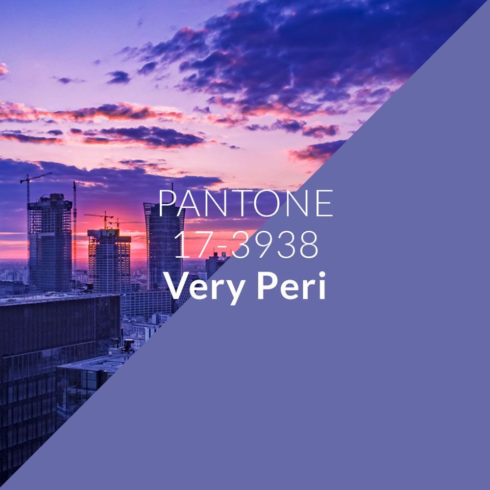
Very Peri is the Color of the Year 2022
Very Peri on MORE
The Pantone Color Institute, at the end of December, presented the color of the year. It is meant to reflect not only upcoming trends but also the spirit of the times. Very Peri - as its charming name goes - is an ambiguous shade. It sits somewhere between purple and blue. A seemingly cool color, yet with a warm note. And indeed, this ambiguity may correspond to the changes we are experiencing here and now.
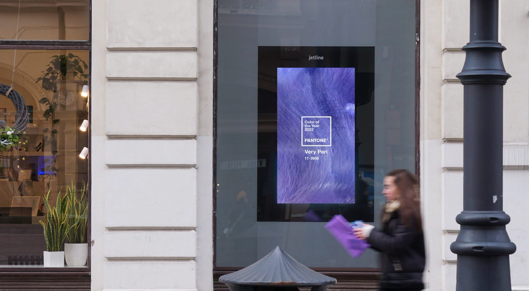
The Institute draws attention to the coexistence of the digital and real world. It's a color that will certainly find its place in both these spaces. We decided to test how it looks on our MORE screens, which on one hand are a digital medium, but at the same time function within the fabric of the city.
The possibilities of DOOH advertising, especially high-quality devices like those used in our media, allow it to resonate fully and reveal all its subtleties and ambiguity.