Digital OOH: Data, Facts, and Ideas. Is Anything most Important?
Recently, there has been much discussion and writing about Digital OOH in the context of numbers, data, audience measurability, and research standards. This is right and important, because DOOH is a measurable medium (spoiler alert: there's a good chance that classic OOH will also soon provide audience data), and it should absolutely be utilized.
However, there are other superpowers of OOH communication, both digital and traditional. These include its natural presence in space and the creativity that often results from it. I am sure that once access to various data becomes common and natural, once this necessary standardization comes into effect and no longer causes excitement, we will more often return to the basics of magic in advertising: creation, ideas, fun, and intelligence.
Marketing communication and advertising are also very much about creativity and ideas, about which we always say that the best ideas are the simplest and the hardest to come up with. To console you, I'll say that once you do come up with one, you immediately know: this is it.
A Good Idea, What Does that Mean?
You surely know that you can start looking for ideas with a brainstorming session. Well, you really can and it's very much worth it. Thanks to it, you will answer the question: what makes a good creation? Noticeable, visible, interesting, evoking positive associations, catchy to the eye and ear... Think and write down as many terms as come to your mind. What does a good idea mean to you, for the communication of this brand, at this time and in this place? When will you be satisfied with it?
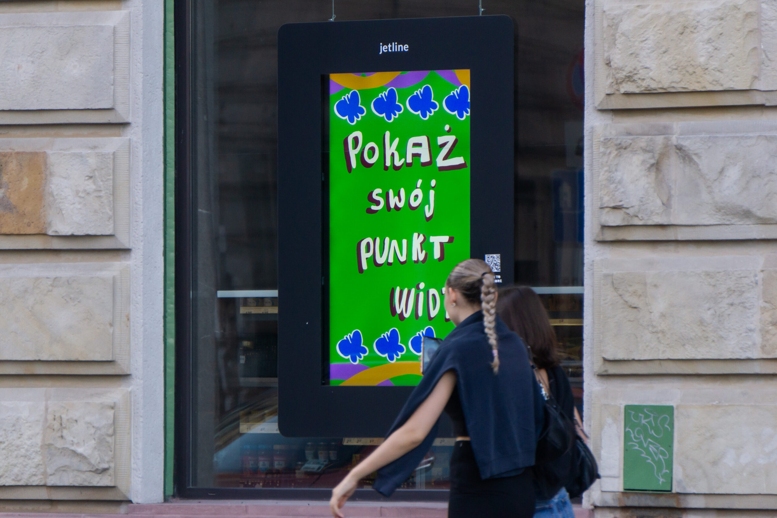
We'll tell you what came out of the research on spots designed for our Digital OOH screens. When we researched graphics for MORE, we learned that people respond better to and remember dynamic, animated creations with vibrant and contrasting colors. They prefer them over static images in delicate, subtle colors.
Also, Decide What You Don't Want (You Probably Don't Want a Weak Design).
In advertising, a weak design is primarily one that disregards the principles of perception. In advertising, the specificity of the medium and how the viewer perceives the ad are fundamental. Sometimes, however, these are not honored, which is why interesting ideas sometimes go unnoticed.
A weak design also arises when individual elements lack balance. Composition, color scheme, typeface, and image are all part of a whole. If the composition is dynamic but the color scheme is pastel, and the typeface deviates from the symbolism, chaos will emerge. And while everything might seem to work individually, the whole creates dissonance.

And we've written more about how DOOH screens work, about creation and creativity in OOH and Digital OOH – for example, here or here. Read and get inspired!


