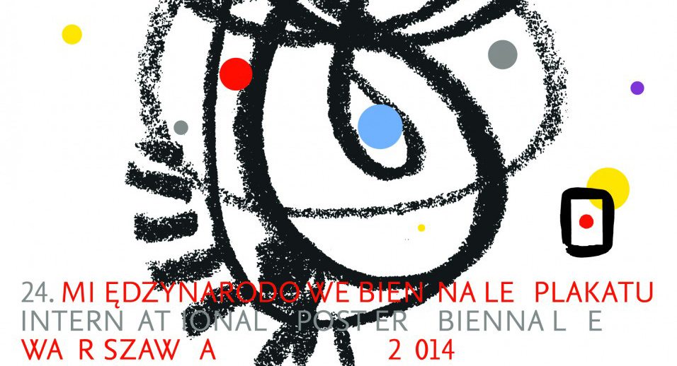
International Poster Biennale in Warsaw
Nearly 500 posters, qualified for this year's edition of the International Poster Biennale, appeared in exhibitions in Warsaw. In the galleries of the Poster Museum in Wilanów, until September 14, 2014, you can admire works by top-class designers of various nationalities. At the same time, the Academy of Fine Arts Salon in Warsaw is exhibiting posters by debut designers from around the world, created in 2012-2013.

As part of the competition, organized for the 24th time, many interesting, talented figures presented themselves, about whom you will be able to read later in the article. The Jury members evaluated a total of 3814 posters. 348 works by professional designers and 64 works by debutants qualified for the competition exhibition. The great interest in the subject demonstrates the importance of the global poster, which increasingly becomes a field of prestigious design, an intentional space in which the designer's character and individual style perfectly harmonize with the conveyed content.
Let's take a look at the profiles and posters of this year's competition winners. Poles continue to lead the way in global design. The gold medal among professionals was awarded to a designer
who received his diploma in Prof. Henryk Tomaszewski's poster studio, and from 1975-1978 was an assistant in Teresa Pągowska's painting studio. The legacy of the Polish Poster School has resulted in extremely lyrical, autonomous and metaphorical images in Wiesław Rosocha's works. The designer adapts graphic drawings and illustrations with a large scale of grays for the needs of applied art, subjecting the ambiguity of the symbols used to the purposefulness of the encoded message. Typography is a compositional complement to the whole. Text in Rosocha's posters plays a secondary role, mainly informational. The poster that received the Gold Medal is largely an honor for Rosocha's entire design and artistic work. The jury, in an international composition, chaired by David Crowley awarded the prize for the poster design accompanying the artist's own exhibition at the County Gallery of Contemporary Art in Ostrów Wielkopolski, titled "Other Areas, Other Formats".
You can get more familiar with Rosocha's works at the exhibitions accompanying the Poster Biennale, as well as on the author's portfolio pages, the link to which I provide below:
http://www.rosocha.pl/
The silver medalist among professionals was Andreas Golde from Germany for the poster Theodor W. Adorno. Folkwang University. The competition jury justifies its decision as follows:
“Andreas Golde's poster illustrating a seminar dedicated to the work of Theodor W. Adorno reflects the delicate construction of the philosopher's writings in the form of quasi-structural blocks. The limited color palette, discreet typography, and halftone technique make a stunning, unforgettable impression.” To better understand the concept of the poster, one must necessarily reach for the philosopher's critical theory, which, unlike the traditional perception of the world
according to Cartesian traditional theory, is not a collection of separate objects and subjects, and their relationships interpenetrate, sometimes one can also say that they interlock with each other. The subject never exists without penetrating society, culture, history, etc. Thus, Andreas Golde's poster captures the essence of Adorno's philosophy. The designer, through the use of halftone, fragmentary photography, and spatial geometric forms that create an impossible figure, introduces the viewer into a space of interpenetrating elements, which, not fully specified, form a whole.

(you can read more about critical theory at the link:
http://libra.ibuk.pl/book/1451
Andreas Golde's work is very diverse, and the form is completely subordinated to the conveyed content. Among Golde's poster designs, we will find minimalism and space filled with elements
in an open composition, a variety of techniques and layouts used. The medium in the form of halftone or flickering geometric forms can be found in several of the artist's works. In a sense, it can be said that this becomes a hallmark. You can see more creative solutions by the designer on his website:
http://andreasgolde.de/

The silver medal was also awarded to Jakob Kirch, a designer who uses modern typographic solutions. His posters emanate an innovative approach to typefaces, structures, use of shapes and colors, which in themselves become a reflection of the content. Kirch, together with a team of designers, plays with form, also inspiring other designers. Kirch received the silver medal for a poster that fits into the assumptions of his work. The poster for the opening of the 2013/14 season at the Municipal Theater in Stuttgart is expressive and powerful, just like the theater itself. It stimulates the imagination and provokes thought.
You can see many of his typographic activities on the website:
http://lamm-kirch.com/
http://www.typographicposters.com/lamm-kirch/


The bronze medal among professionals was awarded to:
Freeman Lau Siu Hong, Hong Kong for the poster: Symbiosis
Lech Majewski, Poland for the poster: Beckett
Dmitry Mirilenko, Russia for the poster: Mayakovsky 120 (1, 2, 3)


Freeman Lau Siu Hong is a designer involved in many fields of design. He is responsible for organizing the annual Design Center and Design Week in Hong Kong for international designers.
The jury, as justification for the verdict, drew attention to the lyrical form of presenting trees, the relationship between humans and nature. In Freeman's poster, there is also a reference to his work, “Chair” for which he received an award. The designer's works combine communication, business, art, and design, and also promote Japan abroad. You can see more of his commercial and artistic activities at:
http://www.freemanlau.com/en/index.html
“Beckett” by Lech Majewski is a poster in which space contrasts with large typographic forms. The composition consisting of a large vertical typographic form and an X-ray figure of a person emphasizes the idea of existentialism, where a person is completely dependent on themselves and their own choices. The poster perfectly reflects the individualism of the person and their closing off to the world. The empty white space further emphasizes the loneliness and freedom of the person in existentialism. Meanwhile, the multitude of inscriptions placed on the woman further strengthens the emotional message of the poster, emphasizing existential dilemmas.
Majewski also comes from Henryk Tomaszewski's studio.
You can see more of his posters at:
http://vidical.com/?gallery-item=75-teatr-powszechny
It can be said that the jury's verdict was completely justified. Therefore, subsequent articles will be devoted to young adepts of design art and profiles of designers whose works we can see in Warsaw.