Numa Logo, Non-hydrostatic Unified Model of the Atmosphere
Brand image creation begins long before the launch of visual advertising messages and their graphic equivalents. Design is very often built on solid scientific, psychological, or humanistic foundations.
The creation of a logo, flyer, or presentation then stems directly from the idea itself, which needs to be presented in graphic form. A team of scientists from the Naval Postgraduate School in Monterey, California (USA), requested a logo design for their innovative model, created to study the atmosphere. Numa is the core of the next-generation weather forecasting system NEPTUNE, used by the US Navy.
I was pleased to design a graphic mark that would reflect and harmonize with scientific systems.
I was pleased to design a graphic mark that would reflect and harmonize with scientific systems.


The authors of the Non-hydrostatic Unified Model of the Atmosphere (NUMA) are Frank Giraldo, Simone Marras, Andreas Mueller, and Michal Kopera, and co-authors are Emil Constantinescu, Sasa Gabersek,Eric Hendricks, Les Carr, Jim Kelly, Shiva Gopalakrishnan, Matthias Laeuter, Marco Restelli, Luca Bonaventura, Jim Doyle, Gaby.
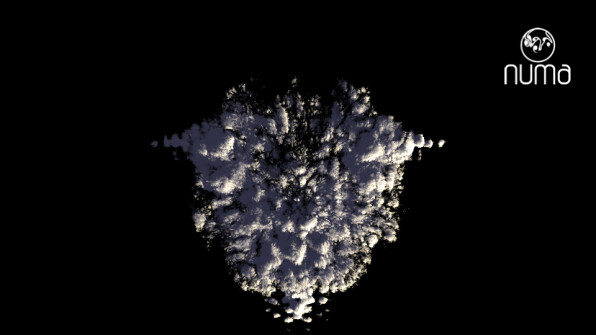
In cooperation with the Numa authors, a logotype based on their numerical grid was designed.
The simplified grid model became the basis of the emblem, enriched with forms symbolizing warm and cold currents, as well as temperature changes.


The typeface used in the logotype is Vagebond C Light Roman, designed by Rene Verkaart in 2003.
When designing a logo, special attention should be paid to the legibility of the mark.
It should look good in large sizes, as well as in miniature. It is also good for the mark to have its vertical and horizontal equivalent. This will allow it to be easily adapted to various types of vertical and horizontal prints.
The Numa logotype was designed in an extended and simplified version to meet all the scientists' needs.
The color scheme of the mark refers to universally accepted symbolism associated with red, yellow, orange, and blue. The temperature degree of the color corresponds to the symbol of the actual temperature intensity.


Logo in contrast


Logo in contrast / logo for t-shirts


More about Numa can be found at the link
http://faculty.nps.edu/fxgirald/projects/NUMA/Introduction_to_NUMA.html
http://anmr.de/cloudwithmaya/

Dr. Andreas Müller
Dr. Andreas Müller