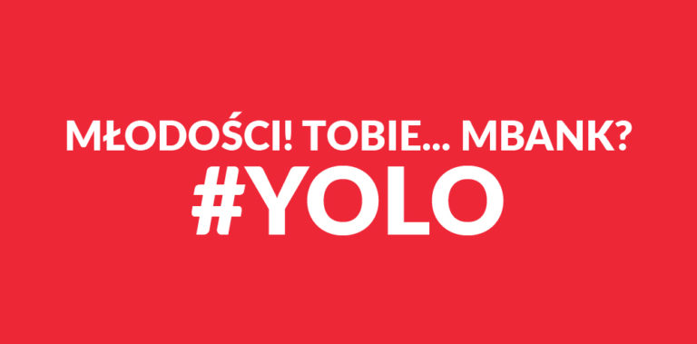
Youth! To You... mBank? #YOLO
A Story Starring a Plunger
What do a plunger, Janusz, a slightly overused hashtag, and a psychedelic deer have in common? At first glance, not much, but mBank decided to use this set of concepts to target Generation Z. The campaign culminates in a new logo, or rather, simply the mBank logo, dressed up as a teenager. It uses a strong, slightly biting color scheme and fights the static nature of the original by vertically shifting the color stripes.

The offer's website is a symphony of dissonances in green-navy-pink tones with an animated deer, a dog with dollars, and a mural by WIUR. Additionally, there are actions involving Polish YouTubers. It's based on an “either-or” dichotomy, meaning reality with and without an mBank account. “Either you're bored, or you're spontaneous”.

According to research commissioned by the bank, young people need authenticity, directness, and offers without hidden catches. Interestingly, empty wallets are also taken into account, which is to be solved by the option of opening an account with a referral to friends. The rewards were chosen after analyzing the “hungers” of young people.

Creative Identity Splits
Wouldn't it be possible to reach young people without performing a lobotomy on visual identification? After all, the bank is the same, as is the name. There won't be club-like bank branches either (although after spending several mind-numbingly boring hours of life on uncomfortable chairs in a traditional financial services establishment, it doesn't sound stupid at all), so the young client, who is being tamed with difficulty, will sooner or later collide with the gray and not particularly inspiring reality of banking.
Generation Z (which, as I checked, are 13-24 year olds) is not, however, the only target for which mBank, along with an individual offer, has prepared logos and visual communication that reference a cohesive system but function separately. Beyond the basic individual offer and the “offer for young people” (there's a lack of specific naming for this service, in my opinion), there are also separate proposals for entrepreneurs, corporations, affluent and private banking. The entire development is handled by BNA agency, which in 2013 plowed through the previous logo with a flower that probably escaped from one of Joan Miró's paintings. The new youth identification is also their creation.

mBank is by no means a pioneer in this field. Another company that recently launched a campaign targeting teenagers is Plus with its “Plush na Kartę” brand. Following the best traditions of the breakfast cereal industry, Plus ventured to create a brand hero – Plushak, who, as we can read in the press release: “Is a king of life and a born hedonist, has many friends, stage dives, rides a longboard, can rhyme well, loves pizza on fluffy dough, and his motto is »pleasure without consequences«”. Visually, Plush refers to internet memes and doesn't strive for elegance – Plushak uses laconic phrases like “want it” and “show your face” on a characteristic, two-color, radiant background.

Mobile networks have a tradition of reaching out to young people – those who eagerly and often use technology, need constant contact with friends, and for whom a phone is both a status symbol and a symbol of freedom. I don't know if anyone still remembers the Heyah campaign, which at one time (over 10 years ago!) caused quite a stir not only with its offer but also with its way of entering public consciousness. But do banks need – and is it profitable – such an approach?

One to Rule Them all?
One of the first things I heard in an advertising strategy class was that you can't make a product for everyone. Even the famous iPhone, which in the US had a chance to become synonymous with the word 'phone', despite marketing support and a bland (read: addressed to everyone and no one) campaign, and its transformation into something akin to a cult, still has to share the market shelf with thousands of other phones.

There are perhaps fewer banking offers, but they don't differ enough to entice a reluctant teenager (whom even a mobile network has to convince with a lack of consequences) to use their network. It's much easier to understand and address the needs of adults (who also earn regularly) than the “cravings” of teenagers. Teenagers are a bit of a “terra incognita” in marketing. It's very difficult to hit on the language they currently use and not look like a man with a combed-over bald spot dressed as a teenager (I imagine banks as a corpulent middle-aged man). By the way, reading “#YOLO in banking” in mBank's press release makes me wonder if anyone considered what that hashtag means?
The days when one size fit all ended some time ago. We look for brands that represent values we identify with, and I don't think anyone identifies with a multi-page banking services agreement and a branch resembling a post office.
While the Paradox of Choice increasingly affects us, streamlining the offer from a specific angle simply makes our choice easier. The fact that someone spent time preparing an offer targeting specific needs (or cravings, if you belong to Generation Z) and then tries to communicate it in language that doesn't require a law degree, builds more human relationships. Of course, all of this can fall apart in an IRL encounter... but the team designing the communication doesn't have to worry about that.

Bank on the Fly - #YOLO
Do I think building separate visual identities for different age/social groups makes sense? Essentially, yes. In mBank's case, their visual system is well-thought-out and flexible. We might not like the colors used, the widths of the individual color stripes, and the arrangement of the letters on them, but these are technical details. A different identity also accompanies the offer on different terms – in this case, the bank invests in customers so that in the future, when they can afford gasoline, they remain in its tender embrace – already in a more subdued color palette and perhaps without #YOLO.
In some ways, adapting the message might reek of condescension – simplifying the message for someone with lower linguistic abilities, but I don't know anyone who communicates in banking jargon. It seems to me that the more companies/institutions start using “human” language, the better. And that's probably for everyone involved.
The plunger motif still remains a mystery to me.
